Power of Color(2)
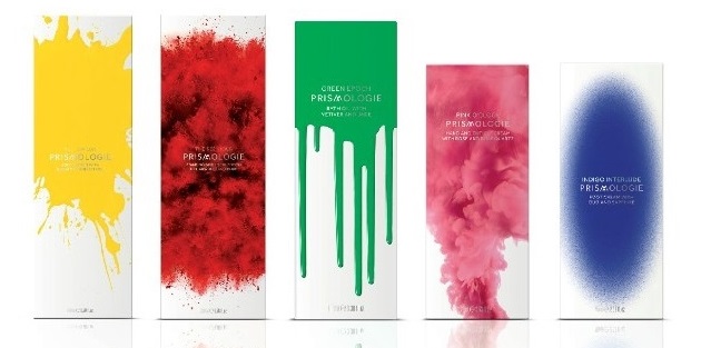
Power of Color (二)
Orange
In color psychology, orange means adventure, optimism, self-confidence and sociability. It is enthusiastic, extroverted and uninhibited.
Orange packaging suggests affordability, fun and adventure. There is almost a degree of risk in buying a product in orange packaging - will it be something different, an adventure, quality at an affordable price, or just something cheap and poor quality.
While some variations of orange can give the impression of cheapness, adding another color to the packaging can change the message and increase the perceived value. Add dark blue to suggest reliability and trustworthiness. Black decoration increases the perceived value of the product.
Yellow
Yellow is cheerful, optimistic and uplifting to the spirits. It inspires original ideas and creativity. Stimulating to mental abilities, it aids in decision making.
In packaging colors yellow suggests either something original and innovative or a cheap, fun product. With its positive and happy energy it attracts children and young adolescents.
Products that aim to lift people's spirits would be appropriate in yellow packaging.
Turquoise
Turquoise, in color psychology, means clarity of thought and communication. It calms the emotions and recharges the spirit, invigorating depleted energy levels and inspiring positive thought.
Turquoise is a good color for health clinics and practitioners as it balances the emotions and calms the spirit.
Using turquoise as the packaging color for cleaning products is ideal as it reflects cleanliness and purity without being too sterile.
Turquoise is generally suitable for both males and females, although males are more attracted to a deeper variation of turquoise such as teal.
Your printing or decoration color can also change the appeal of turquoise. Adding black strengthens the look, adding dark blue makes it more conservative. Adding pink makes it more appealing to the female market, while adding red makes it a more exciting attention-getting package.
Purple
Purple relates to high ideals, imagination and spirituality. Using purple in your packaging colors implies luxury, extravagance, premium quality or uniqueness, particularly if used with gold or silver printing or decoration.
'New age' products are often packaged in purple to suggest individuality, originality and uniqueness. With purple being the union of body and soul, it is appropriate for packaging of holistic products and anything to do with spirituality.
Purple tends to be more attractive to the female and youth market, although it is slowly becoming more acceptable to males.Lighter purples imply fantasy or nostalgic products.
Adding different colors for printing or decoration will add to the messages of the purple; silver or gold adds luxury, prestige and quality, adding red adds energy and excitement, magenta adds liveliness, green or blue will add a feel-good impression.
Magenta
Magenta is a strong and inspiring color which can appear outrageous and shocking on one hand or innovative and imaginative on the other.
If you want your packaging colors to have an impact that says outrageous and lively in a positive way, magenta will do it for you!
Adding dark blue to the packaging will tone down its energy, as will dark green, dark gray or black. Silver or gold will add a degree of elegance and sophistication to the product.
Categories
Hot Products
Tags
Resourced
Manufacturer
Free
Samples
High-End
Customization
Stock
Available
About
We love packaging career
Always pursuing excellence
To maximize packaging value for clients!
Always thinking in clients’ position
To be clients’ most reliable business partner!
Contacts
-
- Address
- 18, Dongling Road, Shenyang, China
-
- Phones
-
- Fax
-
- info@boomingpack.cn
-
- We are open
- Mon-Fri: 09:00AM - 05:00PM
 Send Email
 Sunnyjw2011
 Sunny Jiang