Power of Color(1)
Power of Color (一)
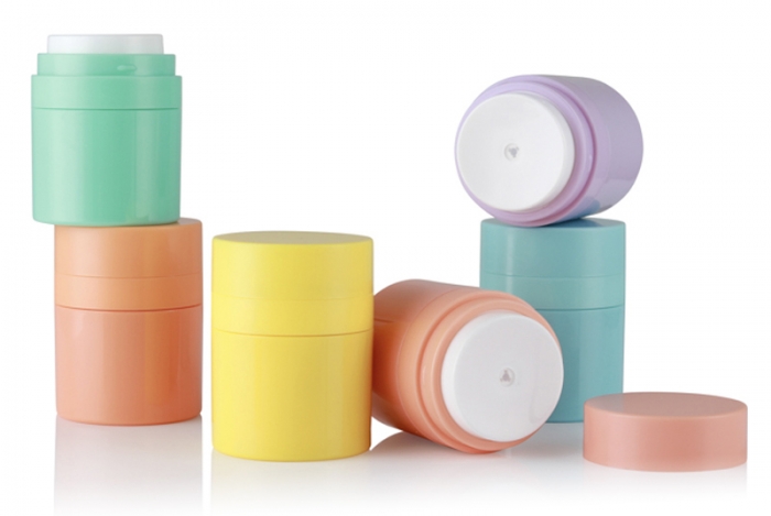
Color is the most important element in cosmetic packaging, reflecting your basic packaging style. It should tightly relate to your logo and products image which you want to show to potential buyers.
Color is very powerful if you make the right choice. Don't make the mistake of choosing your favorite color without checking the subconscious messages of the color first. It might be a great packaging color but just inappropriate for your business image. Here is some psychology knowledge of common colors,
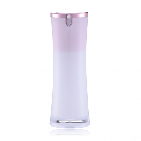
White
In color psychology, white is the blank canvas waiting to be written upon. It relates to innocence, equality and new beginnings. As a packaging color it is safe, basic, unadventurous and conservative, but a good choice where you want to create the impression of cleanliness, purity, efficiency or simplicity.
By adding printing or decoration in another color you can create any number of different messages; adding red suggests excitement and draws attention to the product, yellow decoration implies a more light-hearted, happy and fun product while black decoration or printing adds a feeling of sophistication and prestige.
Use creative and/or colored decoration to set you apart from your competitors. The more colors you use for your packaging colors, the less serious the product - a simple combination of two colors can look more elegant and classy, depending on the type of decoration of course.
Black
Black is the color of power, authority and control. It tends to stand out when used as a packaging color as it makes products appear heavier and more expensive and transmits a higher perceived value. Black adds a degree of mystery and intimidation on one hand and elegance and class on the other.
You can choose printing or decoration for the black packaging in any other color that psychologically sends the message you want to send to your potential customers. Adding gold to the packaging creates elegance and sophistication to attract a wealthier market. Silver has a similar effect. Black with red has an adult or sexual connotation; however people of Spanish background like the combination of black and red as it is a part of their heritage. Adding pink softens the message and attracts the female market, while magenta makes it more striking and attractive to the non-conformists and more creative customers.
The brighter the colors you add to the packaging the less serious it becomes.
Blue
Blue relates to trust, honesty and reliability, strength and unity. When used in your packaging colors it communicates trust and reliability in the product.
The darker the blue, the more professional, serious and conservative the product will be perceived to be. The lighter the blue the softer and more creative the product will be perceived to be.
Blue can indicate a product that will contribute to the buyer's relaxation and calmness. Younger people often see blue to be a color for more mature people so avoid its use if trying to capture the youth market, unless you choose the brighter, more neon or electric blues.
Of course you need to take into account that universally blue is the most liked color by both males and females and therefore the safest color to use, although it is often considered boring and predictable. Just choose the right blue that relates to your specific market.
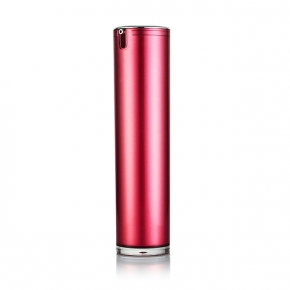
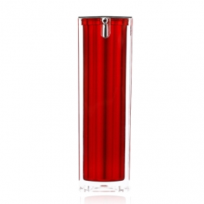
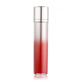
Red
In color psychology, red means energy, action, passion, excitement and strength.
Using red for your packaging colors draws attention to your product, stimulates the senses and excites the potential purchaser.
Dark reds are perceived as professional and luxurious, while bright reds are more exciting and energetic and generally of lower perceived value than dark reds. Adding gold or silver for the printing or decoration increases the perceived value.
Blue-reds are more attractive to the upper class market, while orange reds are attractive to the working class - orange reds have a lower perceived price and value.
Adding black decoration to your red packaging can add sexual or adult connotations.
Green
Green is a color of balance and harmony of the mind, the body and the emotions. In color psychology it relates to security, wealth and growth.
For packaging colors, green suggests natural, organic and healthy, a good color to use for environmentally friendly products. Dark green implies wealth, luxury and professional quality. Adding some silver adds elegance and sophistication. Muted greens suggest environmentally safe and wholesome.
Mid green packaging is appropriate for organic and ecological products, wholefoods, garden and golfing products.
Categories
Hot Products
Tags
Resourced
Manufacturer
Free
Samples
High-End
Customization
Stock
Available
About
We love packaging career
Always pursuing excellence
To maximize packaging value for clients!
Always thinking in clients’ position
To be clients’ most reliable business partner!
Contacts
-
- Address
- 18, Dongling Road, Shenyang, China
-
- Phones
-
- Fax
-
- info@boomingpack.cn
-
- We are open
- Mon-Fri: 09:00AM - 05:00PM
 Send Email
 Sunnyjw2011
 Sunny Jiang